This article was written by OZeWAI member Ricky Onsman.
This is the second part of a two-part blog post adapted from a presentation I gave to the WordPress Accessibility Meetup, based on some learning I acquired while I was working on training modules on PDF accessibility.
In Part One, we looked at some general background on PDFs and accessibility, tools for checking and remediation PDF accessibility issues and what some of those are related to document structure, using Acrobat Pro as our main tool.
If you haven’t already, it’s worth reading Part One before moving on this post. If you have, let’s deeper into some PDF accessibility issues related to Page Structure, Navigation, Forms, and Content issues.
Page structure
headings
Very important. As in HTML documents, section headings are a major aid to content navigation. Properly formatted and tagged headings are announced as headings, can be set as bookmarks for jumping from one section of content to another, and can be listed by screen readers to provide an overview of content.
That also means they must be meaningful and useful in describing the content of their section.
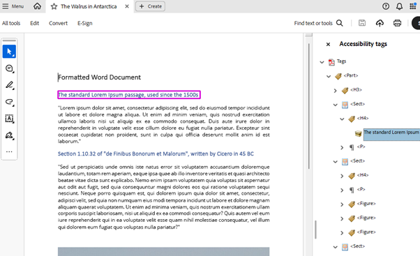
TIP: Headings properly formatted in source material like Word documents should be converted to PDF headings in the conversion to PDF process. I emphasize “should” because this doesn’t always happen. Check them and fix them if they need fixing.
lists
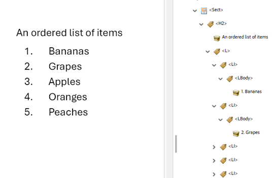
Lists are also very useful to assistive technology when they are properly formatted and tagged. Again, check that they are in your converted doc.
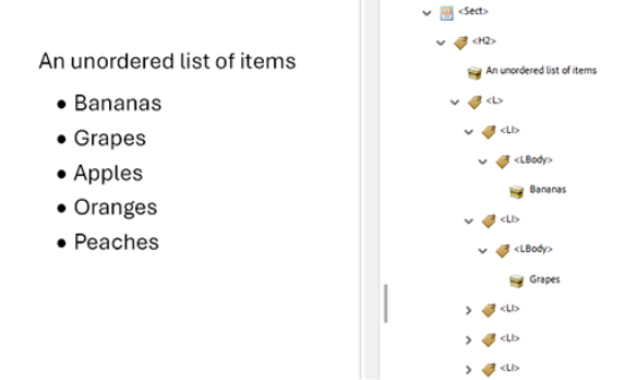
TIP: Bullet points in unordered lists can generally be artifacted (that is, removed from the tag order and thus the accessibility tree – yes “artifact” can be a verb in PDF Land) because otherwise screen readers will announce each list item as “dot” or “bullet” followed by the list item content. On the other hand, the list item identifier in ordered lists should be left in, so that screen readers announce them, e.g., “One” followed by the list item content, which is useful information. This is a judgement call, of course.
tables
There’s a fair bit that can go wrong with tables in PDF documents. While HTML is tolerant of things like absent table headers, PDF is less so.
Tagging tables correctly is essential.
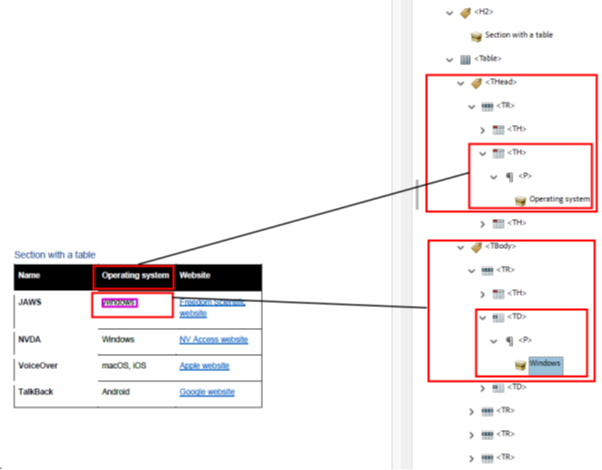
The tags should be structured hierarchically as:
<Table>– the Table element<TR>– the Table Row element, a child of the Table element<TH>– the Table Header element, a child of the Table Row element<TD>– the Table Data element, also a child of the Table Row element
TIP: Use the Accessibility Tags panel to check the table structure.
page numbering
Because many PDF documents are based on a paper structure, they can come supplied with visual page numbering. These are often not tagged automatically in the conversion process, and when they are, they’re often tagged incorrectly. This means you have to go in and tag them or re-tag them yourself to make them accessible to assistive technology.
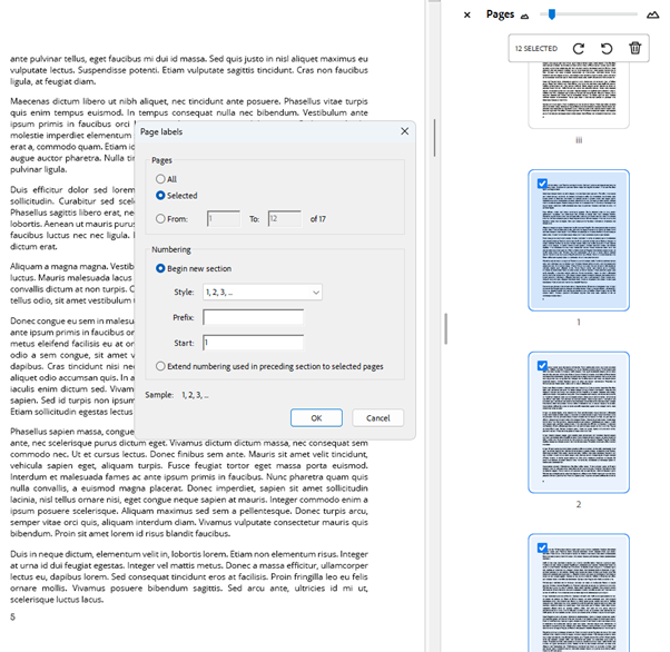
The page numbers displayed in Acrobat’s Pages panel often don’t synchronize with page numbering carried across from, say, a Word document. You can adjust them to be the same as the visual page numbers but it’s a fiddly and time-consuming process.
TIP: If you decide you need to synchronize Acrobat’s page numbering with the visible page numbers, select the pages in question in the Pages panel, right-click and open the Page Labels dialog. That’s where you can change the page numbers.
How much benefit synchronizing and tagging visible page numbers actually delivers is dubious. Many screen reader users find having a number read out for every page tedious, at best.
TIP: JAWS does not announce PDF page numbers by default. Press CTRL + SHIFT + N to open the Go To Page dialog. JAWS will announce the current page number, while the dialog provides the option to move to another specified page.
NVDA does announce the PDF page number by default at the beginning of each page, if it’s present.
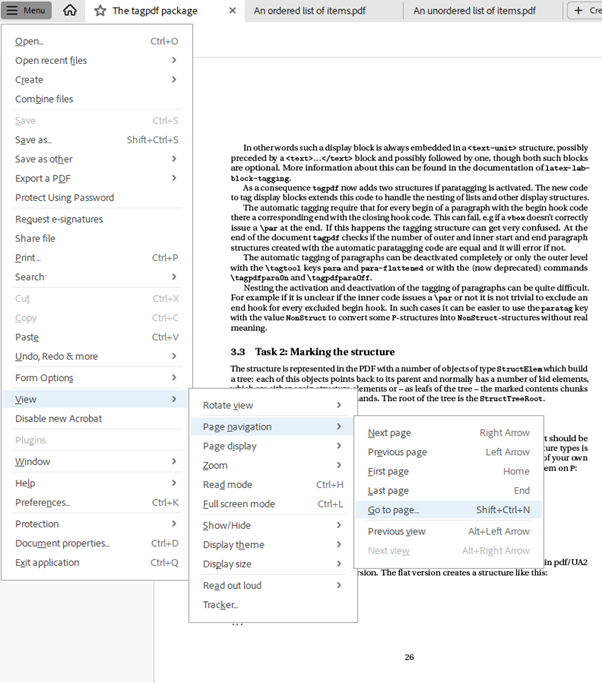
BONUS TIP: If you artifact page numbers, you can still use the Go to Page tool, the numbers will just be ignored by screen readers. And Shift + Ctrl + N is the shortcut for Go to Page.
language changes
As in HTML web pages, you can set instructions for a screen reader to announce specific words or phrases in a language other than the default Language you set in Document Properties. It can be fiddly to do, but otherwise screen readers will pronounce all text as if it was, for example, English.
The thing to remember is your content is encased in tags, so that screen readers know what to announce. If you want the content of an entire tag to be pronounced in an alternative language, it’s pretty straightforward to locate the tag in the Accessibility Tag panel, right-click Properties to open the Object Properties dialog and select the preferred language in the Language field.
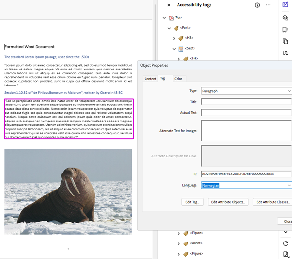
Setting a different language for just one word or phrase in a block of text content within a single tag is a bit trickier.
Make sure the Accessibility Tags pane is open. Highlight the text you want changed in the Document Pane. Open the Options menu at top right of the Accessibility Pane (the ellipsis icon) and select Create Tag From Selection. You’ll see the text is now highlighted in the Document Pane within the larger block of text and has its own tag. Right-click that tag, select Properties to open the Object Properties dialog and apply the Language you want.
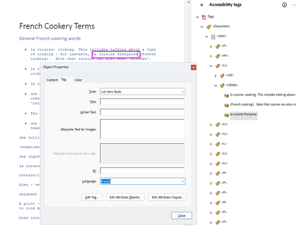
TIP: Check the tag order. Your new tag should sit between the two tags that contain the text in the default language. If not, drag it into place with a mouse, or with a keyboard navigate to the tag, use Ctrl + X to cut it, then navigate to the correct position use Ctrl + V to paste it.
Navigation
multiple ways
WCAG Success Criterion 2.4.5 Multiple Ways says there must be more than one way to locate a web page within a set of web pages. This raises the question as to whether this applies to PDF documents on the web.
As we saw earlier, legislation such as Section 508 and EN 301.549 includes this Success Criterion as one of four that are exceptions because they normatively (that is, in the literal wording of the success criterion) apply to “sets of web pages” and therefore not to “non-web content” like documents.
We also saw that WCAG2ICT includes PDF in its definition of “web content”. So, this success criterion does apply to PDF documents on the web. I should add this is not a popular opinion.
For me, it comes down to practical benefits. In the same way you might add a site map to a website in addition to a navigation menu, it makes sense to me to provide more than one way of navigating within a PDF document.
All it takes is reading “web page within a set of web pages” as “pages within a PDF document on the web”. PDFs have pages, and they’re on the web, so they’re web pages, whether or not each PDF has a URL like an HTML page. Again, this is not anyone’s official position, just my opinion.
PDF readers usually have a Search function built in, but then you have to know what to look for. Page numbers aren’t much use by themselves, either.

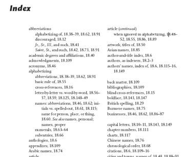
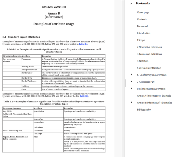
TIP: A linked Table of Contents, a linked Index, and Bookmarks are good ways of navigating to specific content in a PDF. The users can browse, select their destination and jump to it.
links
As with HTML web pages, PDF text links should make their purpose and/or destination clear, either by themselves or taking their surrounding content into account. They should be clearly differentiated from non-link text, and not by color alone.
Highlight the text to be turned into a link, right-click and select Create Link to be guided through options.
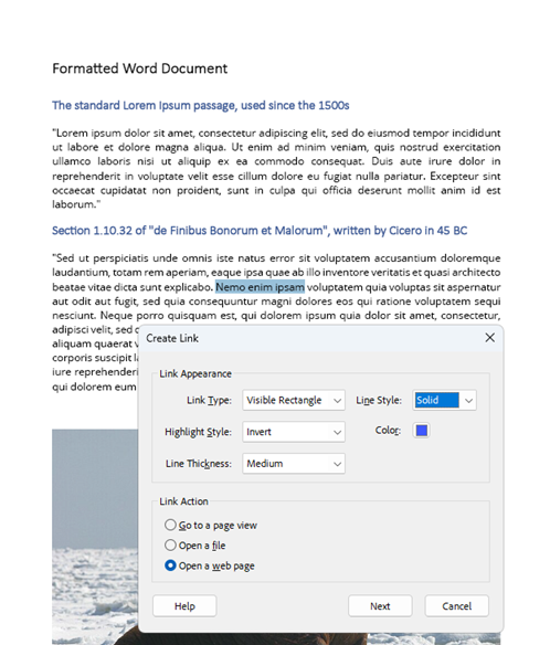
The Link Properties in both Create a Link and Edit Link can be confusing. Here’s a lightning guide.
- Link Type: Two choices. Invisible Rectangle makes the other link properties visually hidden. Visible Rectangle makes the link properties visible.
- Line Style: Three choices. These refer only to the appearance of the Visible Rectangle. Solid displays a solid border around the link. Dashed displays a dashed border around the link. Underline displays solid bottom border, creating an underline effect. That’s right: it’s a visible rectangle but only the bottom part is actually visible. These options are grayed out when Invisible Rectangle is selected as the Link Type.
- Highlight Style: Four choices. This displays when the link is activated.
- None does not change the appearance of the link.
- Invert changes the link’s color to its opposite, so a black text link on a white background briefly changes to white text on a rectangular black background.
- Outline briefly changes the link’s outline color to its opposite and a rectangular outline in the same color, so a red text link on a white background changes to green text with a green outline.
- Inset makes the link jump slightly, momentarily showing a black background.
- Color: Select from a color palette. This affects the color of the Line Style and the Outline Highlight Style. It does not affect the color of the link text.
- Line Thickness: Select from Thin, Medium, or Thick. This also affects the thickness of the Line Style and the Outline Highlight Style.
TIP: Equivalent to standard HTML markup is Visible Rectangle + Underline + None + Blue + Medium.
If you want screen readers to announce something other than the visible link text (perhaps because the visible link text would provide insufficient context when announced by a screen reader), you can navigate to the Link tag, right-click and select Properties, then navigate to the Alternate Description for Links field and type in your preferred text. This text will then be announced by screen readers instead of the visible link text.
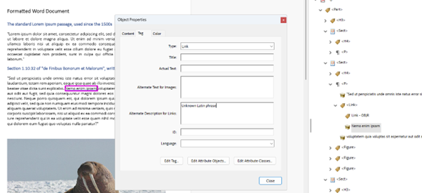
TIP: If you add an Alternate Description for Links, make sure you leave Alternate Text for Images empty, as screen readers will announce the Alternate Text for Images, even if you add an Alternate Description for Links and even though it’s a link not an image. No, that does not make sense.
Forms
If you thought forms on HTML web pages were tricky, gird your loins. PDF forms are not fun, yet are used for some of the most critical content, including collecting information crucial to health, finance, education, legal, and social support, let alone things as innocuous as buying a ticket to a movie or concert.
There are two main flavors of PDF forms on the web: the kind that must be printed out, filled in on paper, and mailed to a postal address, and the kind that are interactive online experiences.
There are thousands, if not millions, of the former, beloved of government departments in particular, which will only accept a paper form with a hand-written signature. They assume all users have a printer, and that people who can’t see will have someone else fill their form in for them.
Their greatest concession to modern technology is that you may be allowed to fax the completed form instead of mailing it. Welcome to the 20th century.
Interactive online forms are slightly better in that they are either digital versions of a paper form where users can tab from field to field and then submit the form, or they’re much simpler procedures designed for the web, enabling everything from ecommerce to logins and search boxes. Both must, of course, be formatted and tagged correctly to be accessible.
All the agony you might feel making HTML forms accessible applies to PDF forms, with some extra pain points thrown in. The best I can do here is to give you some quick tips.
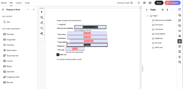
TIP: Use Acrobat Pro’s Prepare a Form tool. This will help you format a form properly and apply the correct and accessible labels and instructions. Do check the results, though.
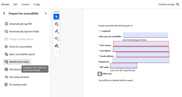
TIP: Use the Identify Form Fields tool in the Prepare for Accessibility menu. This will help you apply the correct roles, names, states, and values for the form fields.
TIP: Be aware that there is a specific checkbox in Field Properties to indicate a field is required. This makes screen readers announce the field as Required.
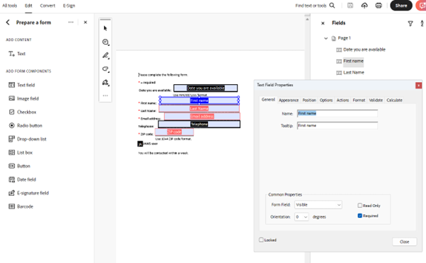
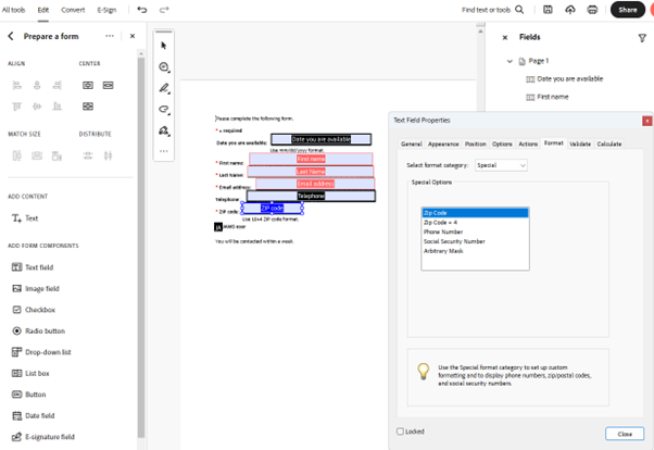
TIP: Use the Format tab in Field Properties to specify any data input formatting requirements, like date, currency, phone number, zip code, etc. Assistive technology can convey these requirements to users.
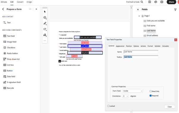
TIP: Information in every field’s Tooltip property is conveyed by assistive technology as the accessible name. The Name property is ignored. Except for buttons. For buttons, the Label property becomes the accessible name. What, you were expecting consistency?
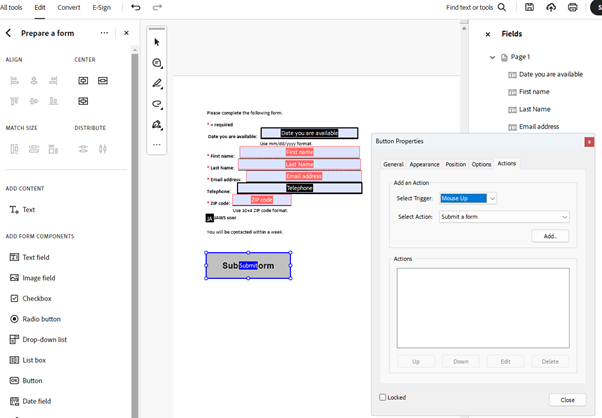
TIP: Make sure any form submit buttons are present, accessible and functional. For some reason, submit buttons in documents with forms converted to PDF are often left off, or non-functional. The Button Properties dialog will let you define exactly how a submit button should behave.
I haven’t even covered things like tagging form fields to make them keyboard accessible, validating form input, making timed responses accessible, or avoiding keyboard traps (and, yes, they do exist in PDF forms).
However, let’s move on.
Content Issues
images
After dealing with forms, image management will feel like a summer breeze. The principles are the same as in HTML. Informative images must, of course, have appropriate alternative text and decorative images must be artifacted, removing their tags and deleting them from the accessibility tree.
TIP: In the Prepare for Accessibility menu, there is a very handy tool called “Add alternate text”. When activated, this identifies all images in a PDF and lets you cycle through a little dialog for each of them. You can check whether an informative image has alt text, whether it’s appropriate and whether it needs adding or editing, or you can mark it as decorative. Much easier than finding every Figure tag in the Tag panel and checking it that way.
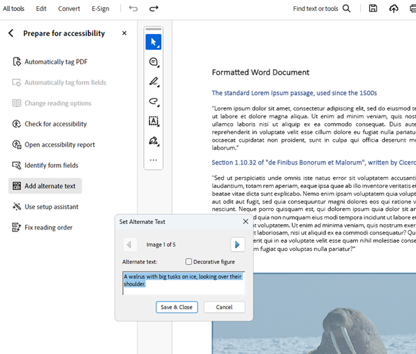
This is not the only way of checking, editing, or adding alternative text to PDF images but it’s certainly the easiest.
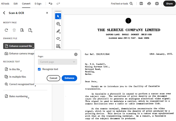
One image issue that is specific to PDF documents is that some documents are, in fact, just one big image. This happens when someone scans a paper document into PDF format. This needs to be converted into accessible, readable text and image content using OCR.
TIP: Use the Scan & OCR tool.
text
Sometimes, text in a PDF can be poorly rendered, especially if it’s been converted from a scanned image with OCR.
Acrobat Pro has some options to help improve the rendering.
From the Main Menu, open the Preferences dialog.
From Categories, select Page Display.
In the Rendering section, select the Monitor setting for the Smooth Text option and check all the boxes for Smooth line art, Smooth images, and Enhance thin lines, and Use page cache. That will make all content, including text, render better.
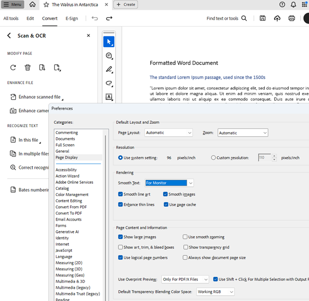
TIP: Setting Smooth Text for Monitor will generally produce the best results for all screen types. There are options for Laptop and LCD screen but in my experience Monitor works well for all screens.
A not uncommon problem with text in PDF documents is that they may not reproduce all the fonts in a converted document. Unlike a web font applied to an HTML document, the PDF relies on fonts installed on the user’s device.
This may result in less common fonts appearing with Encoding Errors in the Accessibility Checker, particularly if they use ligatures.
Ligatures are when two letters are combined into a single glyph, such as a lower case “f” and “i” being combined into a single character where the top of the “f” curves over to become the tittle on top of “i”.
In themselves, ligatures can be good for accessibility, preventing a crammed look that’s difficult to read in cases like that “f” and “i”.
However, when some fonts are converted to PDF, they can become illegible.
Here is some text converted from an MS Word document using Angsana New font. All the letters and words are crammed together and overlapping and difficult for anyone to read, let alone a person with impaired vision.
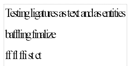
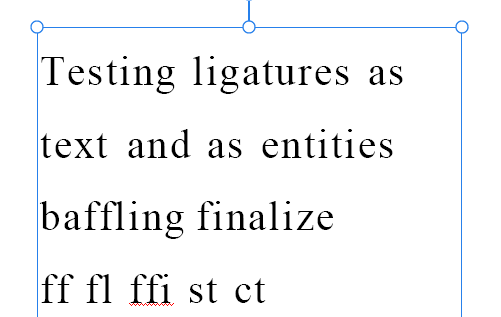
However, Acrobat Pro will let you edit that text, increasing the character spacing so that the text becomes legible, including separating ligatures into their component letters, as shown here.
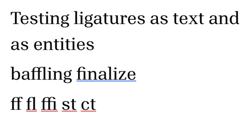
Here is an example of text in a Word document in Aptos Serif font.
Here is the same text converted to PDF, where it has become unreadable nonsense. It’s not actually random, it’s just that each character has been converted to a weird symbol from some other font, making it illegible.
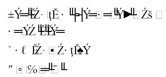
Even Acrobat can’t do anything with this: changing the font from within the PDF has no effect. In this case, you’d have to go back to the source document and choose a more PDF-friendly font.
In some cases, including with some fonts that use ligatures, the end PDF comes out with normal text except for a few characters that the PDF can’t reproduce, which are then represented by black diamond shapes with a question mark inside.
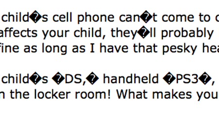
TIP: Manually edit the text to replace the black diamonds with the desired characters in a native PDF font, such as single and double quotations marks in the example.
content reflow
WCAG says users must be able to resize content to make it easier to read for people with low vision, and that the resized content must then remain fully visible within the viewport.
That doesn’t fit very well with one of the PDF format’s basic principles, that content and layout should look the same wherever it is read.
However, PDF reading and editing applications do provide a Reflow function, which can change the content display to a single column that remains within the viewport when the content size is increased.
The content in this Document Pane has been resized to 200%, and the text runs out of the viewports to the right.
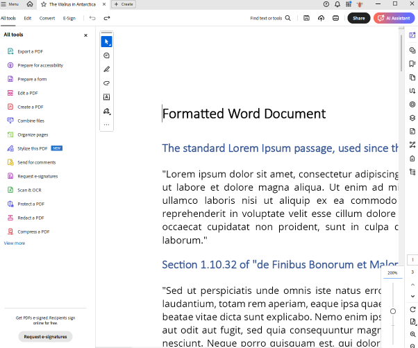
When the Reflow tool is applied, found in the Main Menu, View, Zoom, and Reflow, the content reflows within the viewport.
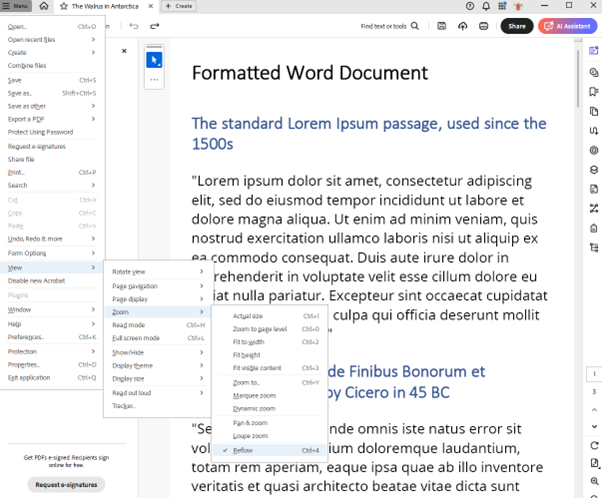
You must always check that the PDF content displays correctly when a user turns on Reflow.
This means, for example, that multiple column content reflowed into a single column has the correct reading order, both visually and for assistive technology. PDF editing tools can do this, but it always needs checking and frequently needs fixing.
There are exceptions to what content can be reflowed with PDF Reflow, just as there are for the WCAG criteria. Tables don’t reflow, , comments, headers, footers, or page numbers.
If a PDF page has a form as well as general text, then the whole page can’t reflow. Images should resize to fit the page when Reflow is used, but they often overlap and obscure text.
If you have, say, white text on a black background and a user zooms the content, finds it spills out of the viewport, and turns on Reflow to make it flow within the viewport, they’ll find the text content effectively disappears. This is because using Reflow removes the content tagging, including that the background is black, leaving the user with white text on a white background. The same happens if the user implements high contrast settings and then turns on Reflow. Interestingly, this doesn’t happen on mobile with Liquid Mode – hopefully Adobe will change from Reflow to Liquid Mode on desktop in the not too distant future.
TIP: Use the Control + 4 key combination to turn Reflow on and off quickly.
annotations
I could go on with more quirks about checking and remediating PDF documents on the web, like embedding videos in PDFs, but I’m sure you don’t have all day.
I do, however, want to briefly mention something you can do in PDFs that’s not usually done in HTML pages.
The idea of PDF Annotations is that a user can do things similar to what someone would do to a paper document. They include:
- Highlighting text
- Underlining text
- Marking text as redacted
- Adding notes on the page
- Attaching sticky notes
- Drawing lines and shapes
These annotations can be used in PDF documents to add instructions to content without changing the content itself.
As an example, I have a long paragraph of text shown here that has been annotated with circles, arrows, checkmarks, crosses, strikeouts, highlighting, outlining, and a sticky note.

Maybe you wouldn’t use all those at once.
TIP: Check that PDF annotations are correctly tagged to make them available to assistive technology or have been artifacted to be ignored by assistive technology.
The Big Catch
You remember way back I talked about opening a PDF in a reader. After all, the vast majority of users will not have Acrobat Pro on their devices, so will open a PDF on the web in a reader.
And that’s where all your hard work in making your PDF accessible can come undone.
Users will access your PDF via a browser, and that’s where the catch comes in.
Browsers like Chrome, Firefox, Edge, and Safari will by default open an online PDF document in their browser-native PDF reader – and none of them will take any notice of your efforts to make the document accessible!
The fact is that to be accessible to assistive technologies, online PDF documents need to be opened in a standalone PDF reader application that recognizes and supports your accessibility settings.
Note that browser PDF readers are fine for quick visual browsing of a PDF document online and may even be OK for printing out a physical copy of a form.
But if you want assistive technology users to understand the content and operate the functionality, such as filling out and submitting a PDF form online, they will need to use a non-browser PDF reader.
There are a lot of free PDF readers out there and they’re not hard to find and install.
Once installed, users need to tell their browser not to open PDF documents in its default reader extension.
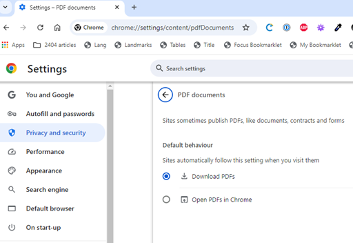
In Chrome, go to Settings > Privacy and security > Site Settings > Additional content settings > PDF documents and select Download PDFs.
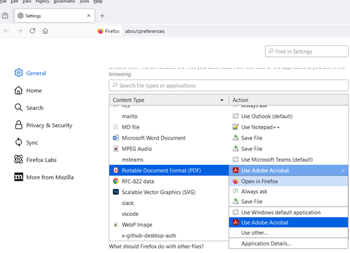
In Firefox, go to Settings > General > Applications and select Portable Document Format (PDF) in the Content Type list. Click on the arrow under the Action column, select Use other… and select your PDF reader.
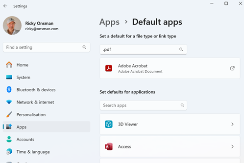
For Edge, open Windows Settings > Apps > Default apps. Scroll down to Related Settings > Choose default apps by file type. Scroll down to .pdf, .pdxml, and .pdx, and for each one click on the existing default, select your PDF reader and then Set Default.
For Safari, open Finder, select a PDF file, and choose File > Get Info. Click the arrow next to Open With and select your PDF reader. Click Change All. When prompted to change all similar documents, click Continue.
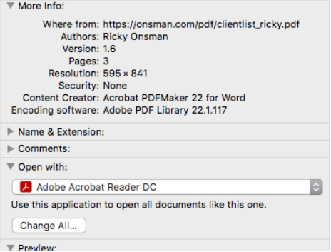
If they’ve installed a separate PDF reader as an extension or add-on to their browser, they can also go to their reader application settings and ensure that PDFs are opened in that way.
For example, to set Acrobat Reader as your default app, right-click any PDF file > click Properties > click “Change” > choose Adobe Acrobat DC or Reader > click OK to save and apply changes.
The final part of this catch is that it’s all very well for me to tell you how to do this, but the critical part is that you tell your users.
You can’t rely on people opening your PDF document to figure it out for themselves, so supply these instructions, or something like them, on the same web page where you have the link to your PDF.
That way, you can be sure that people using assistive technology can get the full benefit of all the accessibility work you’ve put into your PDF.
“Wait,” I hear you cry, “if the PDF is downloaded and viewed with a standalone reader app, is it still web content?”
Good question. Technically, it’s no longer on the web, it’s a file on your device, but it should still be regarded as web content, in the same way an HTML page viewed offline is still web content.
It’s Too Hard!
If this talk has shaken your world, perhaps caused some dismay, made you think you’ve been left with an impossible task, let me ease your concerns a little.
No legislation, standards, rules, or guidelines say that every PDF document on the web must be accessible.
What they do say, is that the content must be accessible. If you can’t make your PDF accessible, you can provide its content in an alternative format.
One way to do that is to publish an accessible HTML web page that provides the same content and functionality as the PDF document.
Tools are starting to become available that make this a practical option. In fact, this may be one of the best uses yet for AI – making an accessible HTML copy of a PDF document.
That might make the PDF redundant, of course, but that might not be a bad thing.
It may end up being a lot easier, faster, and cheaper than remediating PDF documents to be accessible.
We can’t, of course, sit around waiting for that to happen, so you can use the techniques I’ve discussed to remediate your PDFs on the web, with the caveats I’ve included.
Wrapping Up
I want to finish by offering some resources for those of you who want to continue the journey into PDF accessibility.
For full-on training, I highly recommend Chax Accessibility Training, the training courses, downloads, articles, and podcast offered by Dax Castro and Chad Celius.
Dax and Chad also run the Facebook PDF Accessibility group.
Shawn Jordison has created a series of video tutorials in his The Accessibility Guy YouTube channel – very useful for step by step PDF explanations.
Adobe Community: Acrobat is very useful, where people pose questions about using the Acrobat family of products and get pragmatic responses from people like Bevi Chagnon.
In a similar vein but with a broader remit than just Adobe products, the PDF A11y Slack channel is a goldmine of questions and answers, where people like Juliette Alexandria offer their advice.
I’d also recommend following the people I’ve just named wherever you can find them: LinkedIn, X, Mastodon, BlueSky. This way, you can often find out about new product releases or features.
Lastly, use the guidance provided by product manufacturers. In my book, the big three are:
Adobe: https://helpx.adobe.com/acrobat/using/create-verify-pdf-accessibility.html
Axes4: https://support.axes4.com/hc/en-us/community/topics
CommonLook: https://allyant.com/resources/pdf-accessibility-for-beginners/
I know this has been a whirlwind tour through PDF accessibility, very selective and probably pretty daunting.
Really daunting is that there is a whole other level of editing PDF documents that goes deep into the underlying PostScript code: classes, attributes, elements, arrays, and more.
Typically, you don’t need to dive that deep to make a PDF accessible, or at least that’s been my experience.
That concludes Part 2 of PDF Accessibility on the Web: Tricks and Traps.
Originally published: https://www.tpgi.com/pdf-accessibility-on-the-web-tricks-and-traps-part-2/
